
So there is a marking that I guess could be perceived as a "Y" after the letters SLA written with the abbreviation spelled out in parentheses after it. Has this been determined to be a "Y" conclusively or are there any other thoughts on it?
I was looking at the Exorcist letter and the particular way that the character is drawn after the SLA initials seems very much like the characters drawn in the Exorcist letter. It is also not written in the same manner as the "Y" at the end of "Army", which makes me think that it may not be intended to be a "Y".

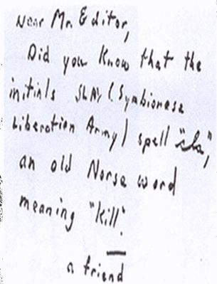
This is what the FBI had in their files, FWIW.

This is what the FBI had in their files, FWIW.
Odd…..so where did that other mark come from? It doesn’t appear to be on the one you uploaded.

I’m not 100% sure these are exact copies of each other:

The letter K in the word KNOW, in each sample are not the same,also the same with the K in KILL(unless copying process is causing this). I would ask Trav to see if he can enhance this. The K’s on the left look like 3 strokes, and the K’s on the right look like 2 strokes. Also, the M’s in the word, MR look different-BY A BUNCH
There is more than one way to lose your life to a killer
http://www.zodiackillersite.com/
http://zodiackillersite.blogspot.com/
https://twitter.com/Morf13ZKS
The reason for the differences might be because one was published in the paper. In the past, I think some of the published photos of Z’s letters were not actual copies of the letters, but a Newspaper Artist’s rendering of the letter.
Yeah….these don’t look the same at all. There are so many differences it is hard to keep count. Do we know which one is the original?

Here’s a comparison, with one image stretched to overlay the other to make it easier to see the differences:

Thanks! That sure makes it a lot easier for comparison…we should do this more often.
The "E" in Editor is for sure different and no doubt the whole "SLA- Y" thing. The rest looks pretty good.

“…they may be dealing with one or more ersatz Zodiacs–other psychotics eager to get into the act, or perhaps even other murderers eager to lay their crimes at the real Zodiac’s doorstep.“ L.A. Times, 1969
I had assumed (maybe incorrectly) that they were copies of the same letter, each from a different generation of copies (of copies, etc). I don’t think either is an artist’s rendition or anything along those lines.

I got a better game on that one…have a look on the letter ‘E’ of ‘Editor’. It’s completely different.
QT
*ZODIACHRONOLOGY*
And the A in the word initials. One is capitalized the other lower case!
This is just a guess but might one have been released to the public and one be from police files that were released much later? Maybe they made slight alterations in the one that was made the public and only the author would have been aware of them and could have identified them? Was this a way to rule out false confessions? Just a guess.
Mike
Mike Rodelli
Author, The Hunt for Zodiac; 3.9 stars on Amazon and
In The Shadow of Mt. Diablo: The Shocking True Identity of the Zodiac Killer, a second edition in print format. 4.3 Amazon stars and great Editorial reviews. Twitter:@mikerodelli
This is just a guess but might one have been released to the public and one be from police files that were released much later? Maybe they made slight alterations in the one that was made the public and only the author would have been aware of them and could have identified them? Was this a way to rule out false confessions? Just a guess.
Mike
I am thinking along the same line. One is obviously thicker lettering than the other and some characters are very different. Something the original writer would have noticed. From the "a" being lowercase to capital to the "M" having a curve at the start.

Without trying to find out the exact provenance of the published letter there are several possibilities to explain what might be going on. I think they are ‘close’ enough to indicate that the one we are used to is a reproduction. Picking up on the differences listed by everyone on this thread it seems apparent that the letter we’re used to has some reasonably major alterations or corrections.
Looking that the side by sides and dave’s animation you can see that there is a ‘cut-off’ starting at the top left and encompasses the D, M and E. The top halves of the M and E appear to have been reconstructed. The D is cut off at the mid point. The overall appearance of the thickness is obviously different and I put that down to copy degradation and this seems to have dictated the style of the reconstructed sections.
The uppercase A in initials vs the lowercase is quite telling. That’s a reasonably hard thing to get wrong so I have to assume that the degradation must have been reasonably severe to have resulted in that mistake. As I have already stated we don’t know the provenance of how we ended up with that altered version but something that I think might have come into play in the right time frame was fax machines. Ok for typed letters at the beginning but not for anything else. I mean, even when I was starting out as a designer the bloody things were useless so I can only imagine how they must have been in the very, very beginning. We were constantly having to redraw things from clients because they had been faxed and with deadlines looming there was no choice.
It depended on the type of fax and the original and so on and so on but the track record and the quality was not great. Add in other factors like ink levels, spread etc and it was a lottery sometimes as to what would come out if the things lol. Also it has to be remembered that the original would have been photocopied before it could be faxed so that’s another level of integrity and definition loss. There’s every chance too that it was photocopied whist inside a protective sleeve with one of those nice cataloging stickers on it – possibly right across the top half of those uppercase letters on the top line. That would have been cut out of the image at the other end (literally) in pre press to get the things ready for print. You had to do what you could to get things ready because more often than not those presses didn’t wait and if they really had to well someone was paying for that cost. It was cheaper to make do with what you could.
In that respect I see nothing suspicious about what we are looking at here. You kids don’t know how good you’ve got it with the digital age. ![]()

“I don’t know Chief, he’s very smart or very dumb.“