yes the sla in one of them nearly looks like the A is a 14
I’m not 100% sure these are exact copies of each other:
The letter K in the word KNOW, in each sample are not the same,also the same with the K in KILL(unless copying process is causing this). I would ask Trav to see if he can enhance this. The K’s on the left look like 3 strokes, and the K’s on the right look like 2 strokes. Also, the M’s in the word, MR look different-BY A BUNCH
The first one looks compressed-But still- some of the spacing of letters are really off. The (L’s) look different and some of the slanting of words are not the same. Could be that Z mailed more than just one of these letters out. Why not mail out the same letter- in hopes it would be received by the right person to acknowledge it is a "Z letter."
The Best Mystery Is An Unsolved Mystery….
Pretty sure they’re copies of the same letter. Differences are probably just an artifact of the copier technology of the times.
one may have been used as a prop in a movie shot? similar to the door reproduction.
Not sure what people are seeing here, to be honest. Looks like a copy to me – it’s all there, just distorted and with artifacts (as you’d expect).
Pretty sure they’re copies of the same letter. Differences are probably just an artifact of the copier technology of the times.
Have to respectfully disagree. The E d in editor are completely different. No artifact.
Possibly someone traced a copy on a light table and simply injected there own hand a different places.
That first one Definitely looks like a 14 to me (Halloween card anyone ![]() )
)
Pretty sure they’re copies of the same letter. Differences are probably just an artifact of the copier technology of the times.
Have to respectfully disagree. The E d in editor are completely different. No artifact.
Possibly someone traced a copy on a light table and simply injected there own hand a different places.
I have to respectfully re-agree? On both counts. ![]()
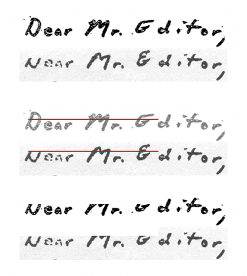
They are the same letter … technically. Has it been ‘re-touched’? absolutely. I did wonder to what extent but having looked at it again I’m convinced and satisfied that it’s ‘re-touched’ and partially ‘re-drawn’.
Copy degradation is evident in the image we have and you can see the hard cut-off line where the tops of the letters in ‘Editor’ had to be ‘re-drawn’. The person doing this was obviously working from that copy and as such interpreted, incorrectly but based on what they had, the letter shapes to complete them.
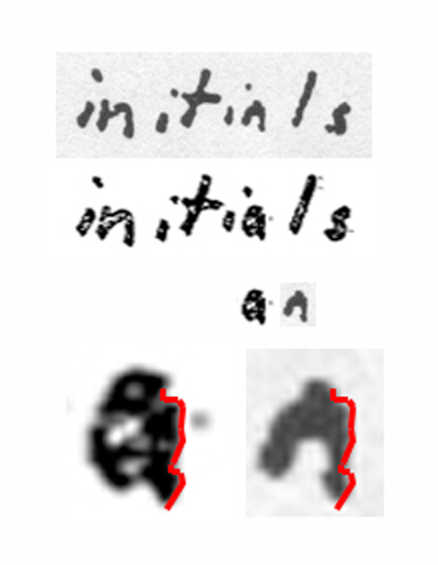
And the A in the word initials. One is capitalized the other lower case!
Even with this I’m satisfied that the degradation was to such an extent that the ‘a’ was incorrectly ‘re-drawn’ as an ‘A’. That tells you just how bad the copy was they originally worked from was.
As for the mystery ‘Y’. Well we could speculate all day on that but without knowing the provenance of the image we are used to it’s kinda pointless. What we do know is that it shouldn’t be there but it is … for whatever reason.
Here’s the ‘Dear Mr Editor’ part with the ‘cut-off’ line shown and then the ‘re-drawn’ section removed. Identical.
So… yeah. It’s a retouched version of the same, albeit heavily degraded, letter. Even the ‘e’ in ‘Dear’ and possibly the ‘o’ in ‘Editor’ had to be retouched but I was too lazy to show that. I have checked though and the existing reference points that remain in it line up with the original.
not sure why people don’t just assume it’s a comma?
not sure why people don’t just assume it’s a comma?
Are you talking about the comma?
oh thanks for clearing that up


