Zodiac Discussion Forum

Notifications
Clear all

Possibly MAJOR Ross Sullivan writing find in yearbook

343 Posts
49 Users
0 Reactions
45.6 K Views
morf13
(@morf13)
Posts: 7527
Member Admin
Topic starter
 

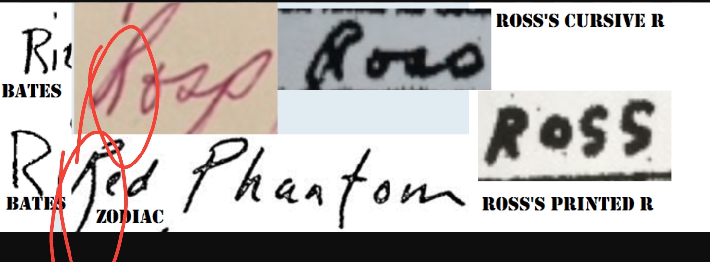
Ross’s cursive capital R different from his printed capital R

There is more than one way to lose your life to a killer

http://www.zodiackillersite.com/
http://zodiackillersite.blogspot.com/
https://twitter.com/Morf13ZKS

 
Posted : December 26, 2017 11:39 pm
(@ham-friend)
Posts: 130
Estimable Member
 

Thanks! The yearbook will be WELL taken care of; I assure you of that! It’s being stored in a 5′, 800lb safe at the moment. I have collected ALL kinds of true crime artifacts over the years but this one is a WHOPPER for me. I can probably take more pics of other pages with sigs in the yearbook if interested. Also, if its ok with you guys I’d like to add some of your examples to my album that I’ve created on Facebook. If this isn’t ok please let me know.

 
Posted : December 27, 2017 12:37 am
up2something
(@up2something)
Posts: 334
Reputable Member
 

I think you all drank too much Christmas eggnog. :D

Nah. It just helps to put it all into perspective. I’ll have another.

 
Posted : December 27, 2017 1:00 am
(@skyward)
Posts: 92
Trusted Member
 

Ross’s cursive capital R different from his printed capital R

Compellingly close in that they each appear to be created in single stroke, with same right leading tail falling off. The Red Phantom letter is unlike the others in that it is showing us a new style, the writer also does not identify himself as Z…..Morrill put his stamp on it, some disagreed but now, seeing R in yearbook….man, that is CLOSE.

 
Posted : December 27, 2017 2:37 am
(@ham-friend)
Posts: 130
Estimable Member
 

Been plugging away again. Here are some unique o’s/0’s:

 
Posted : January 5, 2018 1:06 am
(@ham-friend)
Posts: 130
Estimable Member
 

H’s and P’s:

 
Posted : January 5, 2018 1:07 am
(@ham-friend)
Posts: 130
Estimable Member
 

.

 
Posted : January 5, 2018 1:08 am
(@ham-friend)
Posts: 130
Estimable Member
 

name, underline, name:

 
Posted : January 5, 2018 1:09 am
(@ham-friend)
Posts: 130
Estimable Member
 

Ross "guy" vs Zodiac "guy". The angles and spacing of the "g" and the "u" are almost identical as seen in the overlay

 
Posted : January 5, 2018 1:11 am
(@ham-friend)
Posts: 130
Estimable Member
 

Ross "quiet" vs Zodiac "quietly". The angle and spacing between the "q" and the "u" are almost identical as seen on the overlay. Also note the transposed dot of the "i" over the next letter "e". He seems to do this constantly

 
Posted : January 5, 2018 1:14 am
(@skyward)
Posts: 92
Trusted Member
 

Continues to look good

 
Posted : January 5, 2018 1:19 am
smokie treats
(@smokie-treats)
Posts: 1626
Noble Member
 

Yeah, the dot on the i is way high and to the right. The same.

 
Posted : January 5, 2018 5:50 pm
morf13
(@morf13)
Posts: 7527
Member Admin
Topic starter
 

More writing comparison coming soon, looks quite impressive

There is more than one way to lose your life to a killer

http://www.zodiackillersite.com/
http://zodiackillersite.blogspot.com/
https://twitter.com/Morf13ZKS

 
Posted : January 9, 2018 10:20 pm
(@ham-friend)
Posts: 130
Estimable Member
 

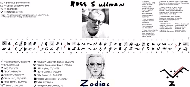
well folks. Here you go. After hours and hours of hard work and research, my alphabet is finally complete. Only missing 4-5 letters. I really had to truncate the file to post here so hopefully it”ll read ok. I can email it out if anyone wants. I havent tilted or rotated any of the letters except where noted. If you find any mistakes please let me know.

 
Posted : January 10, 2018 5:45 am
(@ham-friend)
Posts: 130
Estimable Member
 

ahh yea- its too small to read. Drats! Here are the stripped down versions:

 
Posted : January 10, 2018 5:47 am
Page 5 / 23
Share: