post up the whole letter please.. just picking the eyes out of different letters is well.. not quite right
a few things look good..
Yes, please put up the whole letter. Would like to get a better look at Ross’ writing style.
Please forgive me for not sharing the entire yearbook passage just yet. I am currently in talks with some folks so I need to keep it under wraps. I can maybe share a few other things until then. The yearbook belonged to Edward Knox. He was a sophomore when Ross was a senior. Ed Knox was a member of the *HAM RADIO CLUB*. I wonder if this is how they knew each other. I just don’t see Ross having too many friends. Knox is the one in the glasses:
Well I’m sure Mike will be real interested in more of ross`s writing as we all are. It might just be the bit that will seal the deal.
please get it sorted and posted as soon as you can.
cheers
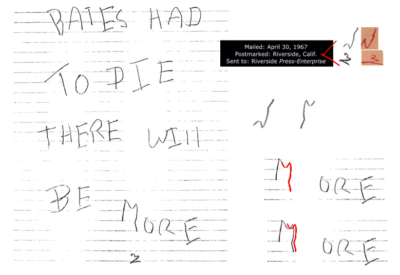
The ‘t’ and the ‘g’ are somehow different. The fourth symbol didn’t appear in any Z letter at all, as far as I can say for now. At least not in the April 30, 1967 Press Enterprise letter. The small z symbol looks similar, however was rotated slightly. As you can see here, too, the handwriting is somehow different as well( http://zodiackiller.com/BatesLetter4.html ). Based on ‘a’ and ‘d’ alone I’d not claim that this handwriting belonged to Z.
If you could please verify where the fourth symbol should come from?
http://zodiackiller.com/BatesLetter1.html
QT
*ZODIACHRONOLOGY*
Thanks for clarification..quite creative.. ![]() even that one seems to be slightly different jmhumblemumble
even that one seems to be slightly different jmhumblemumble
QT
*ZODIACHRONOLOGY*
Traveller is right. They were flipped and rotated. Try and keep in mind, z’s writing here is printed and in marker where as Ross’ is done in pen and written in cursive. The passage is only ten words long not including Ross and the owners name. It’s not like I had a library of Sullivan handwriting to pull these from. Just ten words. All things considered, the similarities are fairly staggering, IMO.
Traveller is right. They were flipped and rotated. Try and keep in mind, z’s writing here is printed and in marker where as Ross’ is done in pen and written in cursive. The passage is only ten words long not including Ross and the owners name. It’s not like I had a library of Sullivan handwriting to pull these from. Just ten words. All things considered, the similarities are fairly staggering, IMO.
The problem is that for there to be anything of interest in regards handwriting the samples need to be comparable. There would have to be clear, identifiable and repeated patterns. It’s great that you have a sample of Ross’s handwriting but if it’s cursive I really don’t know how much use it will be (certainly better than not having it though ![]() ) There may well be what could be considered alarming similarities in line creation and even ‘quirky’ and weirdly similar habits in the shapes but I’ve seen it all before unfortunately. The annoying thing about people’s handwriting is that so many times a lot of them contain very, very similar habits and even quirks that you think ‘must be’ unique to a single author. It’s not the case unfortunately.
) There may well be what could be considered alarming similarities in line creation and even ‘quirky’ and weirdly similar habits in the shapes but I’ve seen it all before unfortunately. The annoying thing about people’s handwriting is that so many times a lot of them contain very, very similar habits and even quirks that you think ‘must be’ unique to a single author. It’s not the case unfortunately.
That’s why we and LE require a reasonable and comparable sample to work from. Cutting sections from letters and manipulating them is a no no. It’s a fools errand and you can convince yourself of anything doing it that way. All you are doing is matching shapes not handwriting and its inherent habits.
Thanks for clarification..quite creative..
even that one seems to be slightly different jmhumblemumble
QT
I left the rotation off by a few degrees to make it easier to see (now corrected and coloured red). See the updated image. ![]() If by different you mean between the Zodiac sample section and the Ross sample … I agree I can see the differences in those as well.
If by different you mean between the Zodiac sample section and the Ross sample … I agree I can see the differences in those as well.
its a bit pointless posting it up like that.. when you can fully post up the letter someone like traveller will examine it with an open mind..
It is a great find. well done. morf will be happy.
cheers


