
Recently I have come across quite a number of posts that are to do with Zodiac’s letters, specifically his writing style. Traveller and I were talking about the letters when Trav questioned the authenticity of the writers style. I hadn’t ever given this any though prior to this and I can only put that down to the letters appearing to have such a fluent and flowing quality to them and appear naturally written. And here is something I noticed while scrutinising the letters that doesn’t make sense at all to me and Maybe someone else could shed light on it.
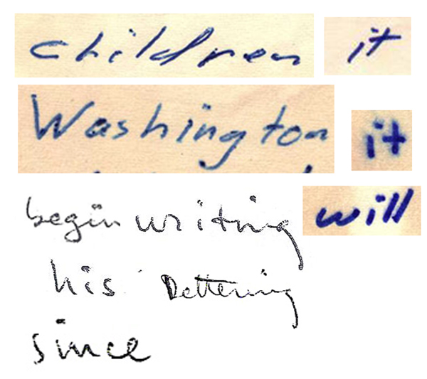
Having used the same blue ink type of pen that Z does to pen many of his letters, I recognized something that I had seen many time occur in my own using of this type of pen. That is the appearance of what look like Full Stops (American’s call them Periods), blobs of ink that stand out as thick round little blobs. This anomaly usually occurs for one of two reasons. It occurs as you are putting pen to paper to begin writing a new word or letter due to ink building up at the tip of the pen, or, it occurs the writer themselves may finish a letter or word, and not remove the pen from the paper instantly and allow the pen to remain still at one fixed point. Here is what I mean with two excerpts of two of Z’s letter and below them I will point out what is extremely odd about it.
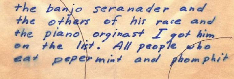

In the first Little List letter example, it is clear that the lower case e’s have a full stop/period like little blob which always features at the end of the e itself at the bottom that is most prominent and Visible in the word ‘Others’. Then when you look for this same consistent feature in the next excerpt, the Stine Letter, we can clearly see that, yes, the anomaly is present in the lower case e, but this time it is at the top of the e in the middle of the letter that is most prominent and visible in the word ‘Speaking’. This type of thing I have found is the same with many of the letters.
My point is, if the blobs were the result of him returning pen to paper and the ink slightly thicker leaving a clear mark where the pen first impacted, then why is it on different areas of the same lower case letter’s? If we write consistently in our normal hand then every A, for example, that shows a thick ink deposit, we would expect to find that blotch in the same place on every A, or at least in 9 out of 10 examples. But these marks seem to be in one place consistently throughout the Little list letter, and then they appear in the Stine letter to have the same consistent placement but in an entirely different place. How can this be if it is natural?
"So it’s sorta social. Demented and sad, but social, right?" Judd Nelson.

WC-
That’s an interesting find. I don’t know how you managed to spot such a subtle detail.
I don’t have any ideas on this, btw. But good find!
-glurk
——————————–
I don’t believe in monsters.
WC-
That’s an interesting find. I don’t know how you managed to spot such a subtle detail.
I don’t have any ideas on this, btw. But good find!
-glurk
Well it goes without saying that your average person would not be able to find such a thing! I am able to do it because I am in the advanced stage of a chronic addiction to the Zodiac Case and the main symptom of this illness is random bouts of sheer obsessiveness. Doctor’s have said there is nothing more they can do for me as I am too far gone. *Lol.
Jokes aside Gkurk, thank you for the compliment’s on the find. To answer you seriously about how I managed to come across such a tiny detail is because of a discussion I had with Traveller yesterday about Z’s writing style. Trav made a few comments on how the feat of constructing such a letter can be achieved by a certain method with the end result appearing to be exactly the opposite of what it is in reality. Then Trav said something about it being possible to detect the signs of it being written with deceptive means but you really have to know what your looking for to see it.
Well that was it, I didn’t believe that the Z letters were written by non natural means so I decided to have a close look at the letters fully expecting to find nothing and report back to Trav with my findings lol. I think Trav may be correct now after finding that. There is just no way that if the dots were natural impressions from the start of each pen stroke that he’d start writing the e from the bottom curve throughout one entire letter, then from the middle top portion throughout another.
Anyway, where the dot is on the top semi circle of the e, that is not a logical place to start the letter from because you can’t write the letter in one fluent motion of the pen if you started out at that position and you’d either have to double back on yourself and over the section you had already wrote, or your have to remove the pen and finish it with a two stroke design. Neither of those seem to have been what he did so why that prominent ink blotch is I really don’t know. It cannot be due to that being the point on the letter e that he ended on because it’s again not a natural place you finish at without going back over what is already there.
"So it’s sorta social. Demented and sad, but social, right?" Judd Nelson.
Let’s assume for a moment that the letters are not written in his normal hand and that he used some form of skilful manipulation to create them. The only thing that those dots remind of when looking at them is something I saw once years ago and it was to do with using reference points to trace images or words. If you don’t want to trace the actual image or words completely because then it becomes obvious to anyone seeing it that it’s traced for example, you just mark points of reference to use as a guide. Best guess I can come up with for the dots in a scenario where we know the letters were created using manipulation.
It isn’t an idea that is that easily dismissed as possible I don’t think because we know for a fact that he had learned one skilled way of masking letters and words from his many Ciphers. I don’t think that someone who is skilled in at least one method of manipulation of the English Language by one means, can easily be dismissed as possibly being able to use another method aslo.
"So it’s sorta social. Demented and sad, but social, right?" Judd Nelson.
I agree that that’s a really interesting observation and worth exploring further, WC. Is it possible that it just represents an idiosynchratic way of creating lower case e’s (i.e. creating a "c" and then making it into an "e")? Just a thought… Can you tell if that is present in other letters?
Here’s a link to high resolution scans of other letters but most are too dark to pick out that type of detail. I don’t, however, see that feature in lower case e’s from a quick look through.
http://zodiackiller.com/letters_index.html
Overall, it doesn’t change my opinion on most of the letters are freely written in Z’s natural handwriting but great observation.
Very impressive find WC – do you have a few more examples to strengthen the case? I don’t particularly need to see them, just curious how much evidence there is on this matter.
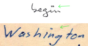
This links very well with a discovery I believe Mike Rodelli made a long time ago now (well, 10 years or so I think, not too long in terms of Zodiac research I guess) where he noticed the cross circle symbol had similar marks to show where Z began and ended the circle. These marks were consistent in most letters but were reversed on others which often contained clues or ciphers, which would indicate the paper was rotated at some point in the writing.
The anomaly of the ‘e’ that you mention in terms of starting point – it could be that Z rotated the page 90 degrees and carefully transcribed the letters in this way to disguise his writing. We all know how hard it is to break learned writing habits and on beginning the ‘e’ he probably put pen to paper in his normal starting position and then had to adjust once the conscious decision to write the letter at a 90 degree tilt. This would also help explain his habit of slowly drifting to a right-hand slant as his letters progressed, I can easily believe this to be the mental fatigue of the transcription process and his brain wanting to shift the letters back round to their normal rotation (which, if he had the paper already at a 90 degree turn would make them appear as a right-hand tilt when the paper was returned to upright).
WC, if you haven’t done much further investigation on this please let us know what letters you have covered so those of us interested can give you a hand with the rest, particularly ones linked with ciphers or other clues
Check out my website: www.darkideas.net
"Very impressive find WC – do you have a few more examples to strengthen the case? I don’t particularly need to see them, just curious how much evidence there is on this matter."
Thank you. It could be nothing of any great significance but they are not random that for sure so they are they by design and if they are they by intended means, what are their purpose?
Well I haven’t gone through every letter in detail but I have gone over them briefly and it seems as thought the two letters in which the dots appear most prominent and regularly are the two letters I used for the example, that being The Little List & The Stine letter. The letter’s that he wrote in black pen I cannot see any, other blue ink written letters I can see the dots appearing but a lot less prominent and regularly, and some I cant see them at all. Again, that’s after a brief look.
I mean if the dots on both letters seemed to appear in a consistent place on the letters I wouldn’t think that much a big deal of it even though it would setill be a rather odd anomaly. But it’s the fact that the dots in the Stine letter are all in a consistent position atop the letter e means that it cannot just be random ink markings, it’s there by design. Then similarly they appear I the L.L Letter, but and consistent as they appear in position on the e’s, they appeap consistently in a totally different position on the letter itself. Again, they can’t be there by a random process they have to have been made to all appear on the same position on the e. Why it is not the same place on the e’s in each letter is the question that I am most interested in answering.
I will try and have a good look through the letters for examples of this because it would obviously be extremely interesting to see whether if the dot does appear on a letter e somewhere, what position would it be found at? But i’ll post examples that are clear to see in the rest f the two letters I featured in cropped examples above
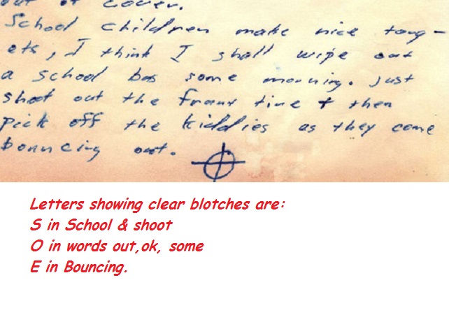
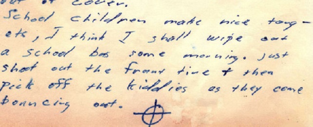
Here is the end of the Stine letter and there are examples that are clear and easily visible..
"So it’s sorta social. Demented and sad, but social, right?" Judd Nelson.

Interesting find, but I do think that it depends on the pen Z had written with. A thick pen would rather create a dot at the end, when the pen is still on the paper however has finished the letter. A stylo, like it might have been used in the Stine letter, could react more when the writing angle.
qT
*ZODIACHRONOLOGY*
Interesting find, but I do think that it depends on the pen Z had written with. A thick pen would rather create a dot at the end, when the pen is still on the paper however has finished the letter. A stylo, like it might have been used in the Stine letter, could react more when the writing angle.
qT
Qt if it was the case that the Zodiac caused these dots by leaving a thicker pen in contact with the letter as he ended it, then wouldn’t you expect the blotches appear in both letters in the same position on top of the e’s for example? After all, if he is writing his natural style then any thing like a blotch at the end of a letter would be in the same place consistently because he would simply write his letter e the same way every time which would mean the end result was be consistent also?
"So it’s sorta social. Demented and sad, but social, right?" Judd Nelson.

Good stuff WC.
Thank god you’re tackling it because there’s plenty of other shenanigans going on in the writing and that’s what I’m looking at, at the moment. Whilst you’re investigating the ink and it’s little hidden habits I would be interested to know what you think of the ‘double dots’. I found them whilst looking at Manalli’s writing.
As for e’s. Did you spot that he alternates them? Sometimes within the same word. One he follows through on the stroke and the other he terminates.

“I don’t know Chief, he’s very smart or very dumb.“
I agree that that’s a really interesting observation and worth exploring further, WC. Is it possible that it just represents an idiosynchratic way of creating lower case e’s (i.e. creating a "c" and then making it into an "e")? Just a thought… Can you tell if that is present in other letters?
Here’s a link to high resolution scans of other letters but most are too dark to pick out that type of detail. I don’t, however, see that feature in lower case e’s from a quick look through.
http://zodiackiller.com/letters_index.html
Overall, it doesn’t change my opinion on most of the letters are freely written in Z’s natural handwriting but great observation.
As I said certain letters do feature similar points of ink, some don’t and it seems to depend on the colour of the pen he’s using.
Black pen: Can’t see any obvious, visible similar points.
Deep Royal Blue: Have spotted them in the darker blue pen but they either appear far less frequently or they are just masked far better and difficult to detect.
Lighter pale blue: They appear consistently in this colour.
"So it’s sorta social. Demented and sad, but social, right?" Judd Nelson.
Black pen: Can’t see any obvious, visible similar points.
Which ones are black pen? Aren’t they just photocopies, so the pen could be blue?
“I don’t know Chief, he’s very smart or very dumb.“
Can’t say I did notice that Trav. I was too baffled as to why the dots changed location on the e for one letter on the bottom, to being atop the e in the other.
And Trav, the position the dot appears in consistently in the "I am the murderer of the Taxi Driver over by…." at the top of the e in the centre of it. Would you agree that not only would this be a highly unusual place to start your letter e’s when you write them, but it’s actually impractical to start at that position because you cannot start to construct a lower case e at that position and complete the letter with one motion because you would either have to stop and double back over what you had just wrote or you would have to use two strokes to do it. The Dot is at the summit of the e’s but there is no sign of doubling back over himself nor is there clear evidence, that I can see anyway, of consistently using two strokes for the e’s construction. So once these have been rules out, why would it be there? Is he just pissing around and dabbing the top of each e with his pen? Well that would be a highly pointless exercise with nobody noticing it anyway. They are not there by random ink marks or a consistent feature of the letter construction itself because while they are extremely consistent in their position through each letter itself, they are not in the same location in each of the letters. l
"So it’s sorta social. Demented and sad, but social, right?" Judd Nelson.
Black pen: Can’t see any obvious, visible similar points.
Which ones are black pen? Aren’t they just photocopies, so the pen could be blue?
The three debut letters Trav where he gives his bragging confession to three Bay Area newspapers.
Yeah I thought it was those and the next letter as well. I suspect they are all blue. I know the Chron letter is because I have the first page of it in colour but the second page is grayscale. The Examiner is grayscale and the Times is B&W or bitmap. So in colour I would assume that they are all blue ink. A minor point and not a correction but I’m just taking the opportunity to clarify. ![]()
“I don’t know Chief, he’s very smart or very dumb.“
