
Good eyes,I knew you would have something interesting to point out. The problem with the desktop,is we only have one J to work with,and hard to know if the fact he was etching/writing (possibly upside down while he wrote)had anything to do with slight differences.
There is more than one way to lose your life to a killer
http://www.zodiackillersite.com/
http://zodiackillersite.blogspot.com/
https://twitter.com/Morf13ZKS

Good eyes,I knew you would have something interesting to point out. The problem with the desktop,is we only have one J to work with,and hard to know if the fact he was etching/writing (possibly upside down while he wrote)had anything to do with slight differences.
I think it was both but mostly writing. The ‘etching’ elements are superficial at best and are caused by the surface. I pointed out before that it was a plywood desk and not a hardwood surface so it would allow more freedom to ‘write’ into the surface but it would also be more susceptible to causing deviations in the ball’s direction as the fibres would give way more easily.
A surface certainly suited to etching but he chose to write on it and work with the deviations that the surface presented. If you look at the overall style, it’s written not etched. Not only are there a lot of ‘traits’ in the writing that I have shown in the comparison to the Citizen letter (there will be more to show in due course) but it’s overall size is tiny which, I believe is also a trait that we see in things like the citizen letter – looks like a full page letter in the images we are used to but remember it’s not, it’s written on a postcard. It has been noted that this ‘tiny’ writing style is an overall feature of Zodiac’s writing by LE. It’s an easy thing to forget when you are looking at images on a screen.

“I don’t know Chief, he’s very smart or very dumb.“

"………the citizen letter – looks like a full page letter in the images we are used to but remember it’s not, it’s written on a postcard."
I’m confused!
Enjoying the thread immensely though.
Have you noticed the "j" in second line of morf’s picture of the little list letter? The one in the word "must"? It’s pretending to be an "s". ![]()

In fact I see a definite link between the desktop poem and the LB car door writing. Besides the confession letter and his own comment in one of his letters, this is another link between Zodiac and Riverside:
His ‘f’ imo is very exceptional, almost childishly round shapes. I did compare the ‘f’ from the word ‘knife’ on the LB car door (right) with the ‘f’ from the passage ‘someone will find her’ of the desktop poem (left).
Below you can find both next to each other, then both letters getting closer and finally both layers together. Putting both ‘f’s together appears as if it was only one letter written, but in fact it is two. You won’t see any second ‘f’ because it is the same …damn handwriting. The only difference is the height of its horizontal line, which imo may differ somehow.
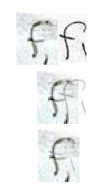
Although the ‘f’ became less childish over the next years (Z had used at least two types of ‘f’, the rather neutral one as well as the childish one – in the same letter!).Since the desktop poem, such Z-style childish ‘f’ can be found in all Z letters listed on Tom Voigt’s website (zodiackiller), until the 1971 LA Times letter. So Z had used his childish ‘f’ in an overall of 15 letters, cards and car door or desktop writings. Only the Halloween Card had no lower ‘f’ at all.
The neutral ‘f’ then still can be found 3-4 years later in the 1974 SLA letter and did Z’s handwriting appear to overall change during those years: The childish ‘f’ became less childishly, rather neutral, and later even the lower part of the ‘f’ was more oriented to the right than to the left. His whole handwriting got sharper and can this be seen very well in the Citizen Card, later in the Red Phantom letter. Even the Top Secret 1978 letter still shows up with this neutral type of ‘f’, like in ‘finally‘, ‘rest of the world‘ or ‘after all‘.

It should be mentioned that the Melvin Belli letter from 1969 was written in a very ‘neutral’ way. There the ‘neutral’ letter ‘f’ is written in perfection and does the whole letter appear as if the author had tried to avoid his own handwriting like in no other letter. His handwriting is recognizable in all of those letters, although some appear to have been written in a neutral way by purpose. Z did this the first time in the Belli letter and do I believe that this had a reason:
IF MELVIN BELLI HAD KNOWN THE HANDWRITING OF Z, ZODIAC WAS ACTUALLY FORCED TO CHANGE HIS HANDWRITING IN THE 1969 BELLI LETTER.
Z kept this way of ‘neutral’ writing somehow upright, but only four months later – when sending to the Chronicle – it is easy to recognize his personal handwriting again.
I had and still have the theory that Z was a colleague or at least somehow known to Melvin Belli. Not only because of the ‘nasty’ buttons Z had mentioned on Belli (one picture exists presumably with Belli wearing a button of the American Lawyer Association), but also because of the Chronicle/Hearst connection (‘SLA’ letter only weeks close to Patty Hearst).
QT
*ZODIACHRONOLOGY*
Trav, preaching to the choir, I think there is no doubt of the writing link. That Candy Cane F is exceptional,that’s one of the first things I look for when examining Suspect writing samples, as that usually jumps right out. (Thats why i sent you that one TX. writing sample with similar F)
NAPA PD has a suspect from Riverside in their suspect pool who has a F that is almost identical,but the problem is, the rest of his writing doesnt look much like Z’s.
There is more than one way to lose your life to a killer
http://www.zodiackillersite.com/
http://zodiackillersite.blogspot.com/
https://twitter.com/Morf13ZKS
"………the citizen letter – looks like a full page letter in the images we are used to but remember it’s not, it’s written on a postcard."
I’m confused!
Enjoying the thread immensely though.
Have you noticed the "j" in second line of morf’s picture of the little list letter? The one in the word "must"? It’s pretending to be an "s".
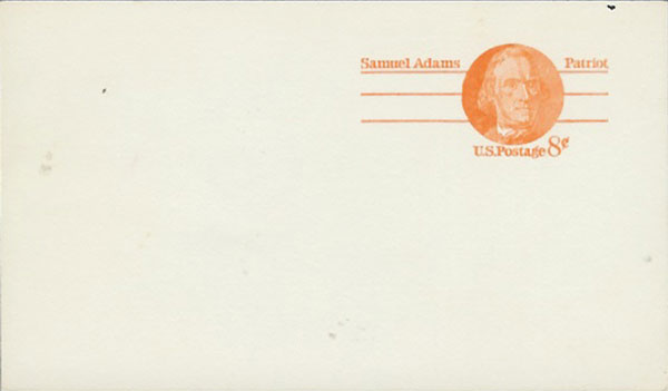
Sorry Smithy, maybe I put that a confusing way. What I’m is that the Citizen letter isn’t a ‘letter’ it’s a postcard. When you look at it on screen it’s easy to forget that because it looks like a letter but it’s on the back of a postcard so you have to remember the scale of the writing must be reasonably small as it is on the desk. Something which is brought home when you view the photo of the desk with the ruler in it for scale.
It’s not a feature of Z’s writing that gets mentioned too often these days but I remember it being something that I think LE pointed out at some stage.
As for the s that’s a j that’s an s. Yes I see that quite often. I see it as, lets call it character formation deformation transference (CFDT). With characters like his J’s there a sort of sliding scale in the construction and you can almost plot it. He starts off with the neater versions and as the scale descends he introduces the little kink and then a more relaxed top. Eventually he ends up with something approaching an s. So, in that respect it’s not too surprising that when he is forming his S’s that are similar that there is a little CFDT happening there.
He does it with other characters as well like his N’s and U’s. They cross each other at different times and become almost indistinguishable. I would imagine this extenuated by the writing size and the choice of pen, preventing less freedom in defining some characters.
“I don’t know Chief, he’s very smart or very dumb.“
Trav – you got me, I knew the Citizen letter had an envelope, didn’t think it was a postcard, then. Gosh.
BTW – I’ve always liked the Citizen letter, since I’ve always thought of it is the "natural" handwriting of our subject, and probably the one letter written with the least level of emotion. Except of course he may just have exchanged some glee in the others for some genuine anger in that one – who is to know?
Re: that "s" is a "j" is an "s" – it is, isn’t it?
Re: Text size, yes that’s something I’ve heard a few times too, and I would LOVE to see the letters at the "right" scale on one image. Maybe I’ll get around to it one of these days, if I can assemble enough images with a forensic scale in them – and figure out common ground, of course.
Unless some clever bloke’s already done it, that is. ![]()

BTW – I’ve always liked the Citizen letter, since I’ve always thought of it is the "natural" handwriting of our subject, and probably the one letter written with the least level of emotion. Except of course he may just have exchanged some glee in the others for some genuine anger in that one – who is to know?
I think Zodiac had changed his ways and was truly disgusted at the thought of guns and murder. No, not really.

“…they may be dealing with one or more ersatz Zodiacs–other psychotics eager to get into the act, or perhaps even other murderers eager to lay their crimes at the real Zodiac’s doorstep.“ L.A. Times, 1969
Trav – you got me, I knew the Citizen letter had an envelope, didn’t think it was a postcard, then. Gosh.
Are you sure it has an envelope? When I was putting together my ‘zoomify’ comp for the envelopes I found the source of a postcard that I think it was written on the back of. A Samuel Adams pre-stamped one. It was a postcard, that I remember because I was slightly surprised at the time because I too had just assumed it was a letter.
I also think I read something somewhere at the time that confirmed it was a ‘card’ not a letter.
T has just posted about purchasing the actual Lincoln postcards he used and has very helpfully provided a scaled shot and dimensions.
http://zodiackillersite.com/viewtopic.p … 6688#p6688
“I don’t know Chief, he’s very smart or very dumb.“
Pah, correction (and I need to put down the beer and the bong I think) – I should have said I THOUGHT I was looking at an envelope on killer facts, but of course I was looking at a Sam Adam’s card.
Y’know, I thought he’d perhaps sent in the "A Citizen" card with the key for the 408 on, but mistrusted the other cards completely.
TIme for another re-think.
Yes, the other shot with scale and dimensions is interesting, ain’t it?
I’d like to be able to compare the scale of the known writing to that of some of the suspects, like Ted’s for instance. That would be nice.
I’m confused. (What’s new)
While I know it states "card" that’s a lot of writing and there is no sign of the pre-postage stamp on this:
http://zodiackiller.com/CLHR.html
“…they may be dealing with one or more ersatz Zodiacs–other psychotics eager to get into the act, or perhaps even other murderers eager to lay their crimes at the real Zodiac’s doorstep.“ L.A. Times, 1969
Been a confusing day hasn’t it? Have a butcher’s at:
http://www.zodiackillerfacts.com/galler … p?album=21
I’m confused. (What’s new)
While I know it states "card" that’s a lot of writing and there is no sign of the pre-postage stamp on this:
There is on the reverse though. What I’m not sure about is the proportions when you see them side by side on ZKF as per the link Smithy posted (proportions are not always maintained though when it comes to posting images on the web). As far as my viewpoint is, it is that it was written on the reverse of a pre-paid Samuel Adams postcard.
As far as a lot of writing is concerned. That’s what I was getting at re size. He writes tiny, apparently.
“I don’t know Chief, he’s very smart or very dumb.“
I was thinking it was folded for some reason. I shrunk the image…it’s easier to get the gist.
“…they may be dealing with one or more ersatz Zodiacs–other psychotics eager to get into the act, or perhaps even other murderers eager to lay their crimes at the real Zodiac’s doorstep.“ L.A. Times, 1969
Looking at the relative scales of the written side vs the address side they seem pretty close. If anything I would say that the written side we are used to seeing has been slightly cropped at the top. It makes sense as the ‘writing’ is quite close to the top of the image so I wouldn’t have any problem with it being a bit lower in reality. The width is bang on.
Overall though it’s close enough for me.
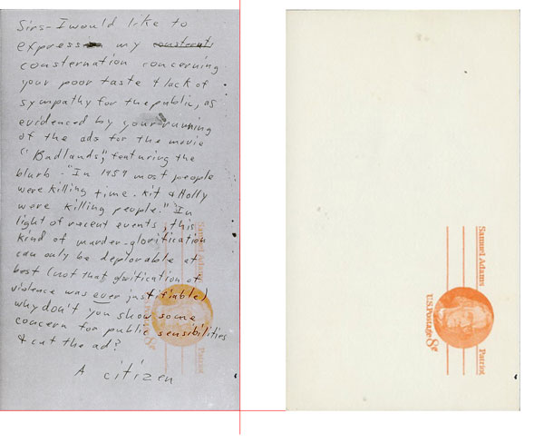
Here it is with the widths equalled. You can see the little bit extra on the height as it drops below the red line.
“I don’t know Chief, he’s very smart or very dumb.“
