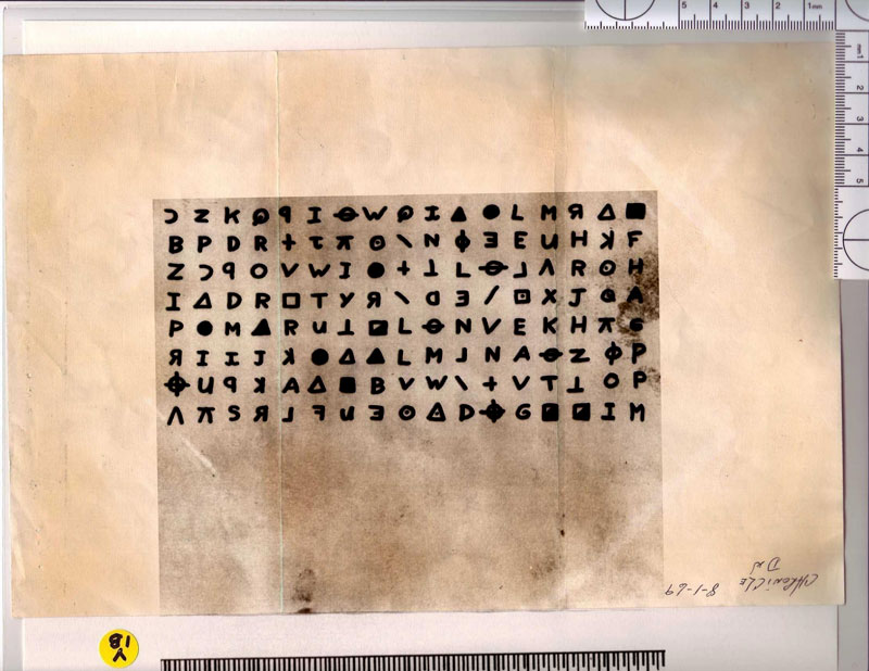
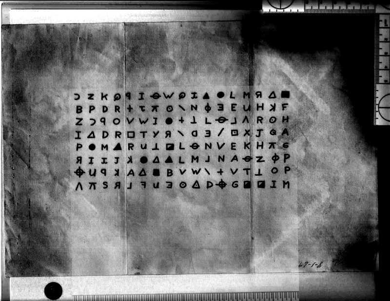
I would say they are too. Authentic that is and not movie props. On a very basic level, they are dirty and old. The ones in the move would not have been as they were to represent the letters ‘at the time’ ie , new, not aged or torn etc.
I’m not so sure. Here’s one place I found that image of the 408:
http://moviehole.net/200710403caffeinated-clint-160207 (Letter 3)
The images came from Paramount. He calls them "real letters" but that still doesn’t mean they aren’t just reproductions of the real letters. *Shrug*
There is also this image:
It used to be on Tom’s site (up until about 2001 or so), and I can’t find it anywhere else.
This is a good example of the tiny black specks that appear on Zodiac’s writings. Look at the top of the page and around the edges and in between his printing. When I first began reading at this site in 2009, I thought the marks were probably ink spots.
I have many letters from my poi whom I am trying to eliminate from any suspicion in my mind as I cannot fathom him being capable of harming anyone or anything except a fly or other insect or unless provoked and he was forced to defend himself. These letters have these same specks on them.
Recently, I posted somewhere here about these specks as I’d just returned from visiting my friend and asked him about them when I saw the same marks on a paper he had on a table next to the chair where I was sitting. He said they were spittle that resulted from his frequent gum chewing.
I’d never thought of something like that but now think it entirely possible that this is what these marks are; Zodiac could have been chewing gum and sneezed resulting in these marks which should imo be tested for dna!
There is also this image:
It used to be on Tom’s site (up until about 2001 or so), and I can’t find it anywhere else.
We need a "photoshop genius" – Trav, I mean YOU. To compare that image with the one I posted earlier. To my eye, they are ABSOLUTLEY IDENTICAL.
But what do I know. I still use MS Paint for images, LOL.
-glurk
EDIT TO ADD: In any case, I don’t really care about being "wrong or right." I just want to have the absolute best possible scans (they are evidence!) that are available and be sure that they are not fakes or movie props. I think it’s important for many reasons. I remain 99.9% sure that my image above is the real Z letter – and if it’s a repro, it’s a damned good one – but I think it’s good to try to clear this up.
——————————–
I don’t believe in monsters.
Nice work trav. So, either the reproduction is an extremely faithful copy of the original, or it’s the original!
Nice work trav. So, either the reproduction is an extremely faithful copy of the original, or it’s the original!
Yes … I think. What are we suggesting might be a reproduction? The hi-res of the 408 section? If so then it’s the original and not a reproduction. I think lol. No that’s gotta be right. If we’re wondering if it was produced for the movie then I would say I can’t see why. It doesn’t fit because it’s too old. It’s likely that the image was procured/produced for reference in recreating material for the film which would explain the timing of the appearance of these images that we are wondering about. That would make sense given that the images, for the most part, that existed up until then were of quite poor quality and not even in colour some of them. So … it’s quite possible and probable that these images are recent photographs of the original evidence taken for the purpose of prop production on the movie.
That makes sense. To me anyway lol.
Hey,
traveller1st,
I did exactly the same thing as you. ![]()
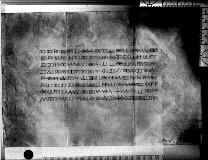
However I’m not 100% sure that they match. The symbols on doranchak’s example are thicker, the folds on glurk’s example are much more visible. The reversed K on row 2 does not have a black speck above it in glurk’s example and some other stuff that doesn’t match up 100%.
Btw, might the little "R" in the bottom-right corner in some of the Zodiac letters that are around mean reproduction?
The symbols on doranchak’s example are thicker, the folds on glurk’s example are much more visible. The reversed K on row 2 does not have a black speck above it in glurk’s example
It’s called copy degradation. That’s why the symbols are thicker because of that process/effect of ‘spread’. It also has the opposite effect on less defined elements such as the fold lines so they are more faded in the nth generation copy that Dave posted. Also that’s why there is no ‘speck’ in the one glurk posted because it’s a ‘clean’ image free from degradation and artifacts. No mystery, just the magic of photocopiers. ![]()
As for the ‘R’ you never know, it could mean reproduction but it would mean reproduction from original if it did.
traveller1st,
Schooled as a graphic designer I’m very well aware of all those things. But I don’t know how well a high quality reproduction can appear.
Then the speck somehow came into existance in doranchak’s example. The partial palmprint or whatever it is has not faded out, but the folds have. And there are other things that just don’t match/add up 100% that I found last night. I still find the symbols to be very thick on doranchak’s example, even with degradation in mind. I’m undecided.
Well I wouldn’t want to argue with someone who’s been schooled as a graphic designer. ![]()
![]()
Anywho.
Here’s the two images offset and as you can see the difference in ‘thickness’ is negligible and entirely consistent with, if not copy spread then exposure setting maybe on a reprocamera resulting in bleed/feathering. Either way, to my eye, they are the same image albeit from different sources and at different stages and via different processes. The shapes on the letterforms are consistent with each other across the image and again, despite the minor ‘thickening’ on one set they still maintain their identifiable form and every little nuance and angle therein.
IMHO. ![]()
I agree with Trav, and I think the high-res scans are authentic. I’m even more sure than 99.9% now in fact. Let’s say 99.9999%, LOL.
Look at it this way, David Fincher has always been known as one of the most detail-oriented directors in Hollywood, and Paramount Pictures has tons of money to spend, and would fairly easily be able to get access to the original Zodiac documents for research purposes. And the letters were released by Paramount as "real Zodiac letters." And in the case of the 408 sample, it is so exact that EVEN THE STAINS MATCH.
And as Trav said, if they WERE repros made for the film, they would not look aged, they would look new, as they would have been contemporary with the time in the film.
And why in the hell would Paramount release high quality scans of forged / fake movie prop letters. That doesn’t make much sense.
I’m convinced they are the real deal. Everyone else can agree to disagree or whatever. I don’t care.
-glurk
——————————–
I don’t believe in monsters.
traveller1st I just felt a bit butthurt by "It’s called copy degradation.".
Don’t worry about it. ![]()
And I guess you guys are right. It is very likely to be real. It doesn’t make sense for it not to be. Sorry for being a bit difficult.


