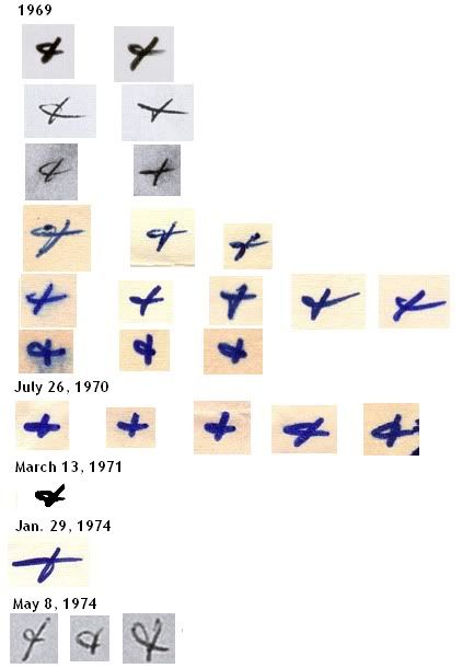
The ‘+’ is perfectly, but perfectly Z-style.
QT
*ZODIACHRONOLOGY*
The ‘+’ is perfectly, but perfectly Z-style.
QT
Yes, good point, lets not forget about those pesky ampersands. They could probably deserve a thread to themselves.
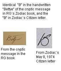
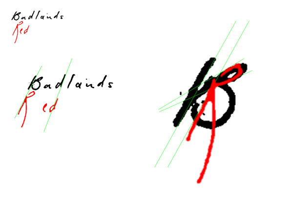
Regarding the B’s and R’s. That B in Badlands has always stuck out at me. It is so unlike any of the other construction of sed character. I’ve always wondered and hoped that there would have been a previous precedent for it. There might be but I can’t recall spotting it or settling on a closest candidate.
I have however, I think, found another use of a similar construction. The top loop is small and disproportionate to the large bottom half of the character. This I believe is repeated in the word ‘Red’ in ‘Red Phantom’. It is also supported in context by the other characters in the two words where they line up with each other (marked with green lines). There are also commonalities in the construction on the lowercase d’s, not just their angle but I think this is enough to illustrate what I’m suggesting.
Concerning Zodiac’s "B"
Here is what I posted back in Jan 2011 on zodiackillersite.com:

(more of my post about this in the link)
Hi, english is not my first language so please bear with me ![]()
And here are a collection of Zodiac’s "&"/ampersand’s I posted on zodiackillerfacts.com back in May 2010:
http://www.zodiackillerfacts.com/forum/ … 9&start=10

Hi, english is not my first language so please bear with me ![]()
Trav,
Knew there was something I forgot….elsewhere we spoke about the inconsistencies in the high resolution copy of the Stine letter…namely, that while the letter itsefl appears to be written at normal speed, the individual letters showed signs of the pen stalling in places one wouldn’t expect, given the natural flow of normal handwriting.
Did a couple of experiments (and while not enough in to be conclusive) and it does appear to happen when the pen is held in an unnatural position/ weaker hand
I’m inclined to beleve the bates letters were produced in that manner
I should probably put this in an SLA card thread somewhere too but given it’s nature it seemed relevant to put it here for now. I had wanted to complete and present this project in a more finished fashion but it hasn’t turned out that way. Sooooo I’m just gonna dump stuff in here as I work on it and will probably go back and organize everything into a PDF with concise explanations of what I’m seeing. (Duckking will be pleased to hear ![]() )
)
Right …
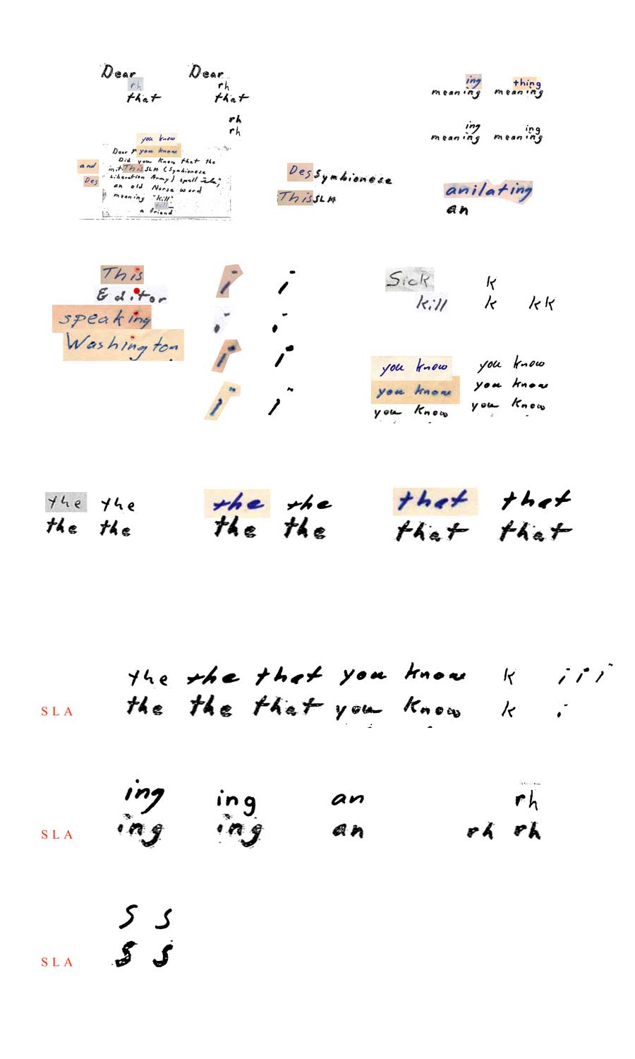
…the SLA card (Tahoe won’t be pleased to hear lol), IMO is a Zodiac communication. I agree with a lot of comments made such as it looks the least like Zodiac out of all of them. That is true in a way. On the surface at least. However, once you start to look at the similarities, well, they just keep coming. Most likely because they are actually there.
There is probably more I could do on this but I think these quick examples pretty much say it all. The consistency in shape, form, angles of letters, gap between certain letters, relative sizes between certain letters, the shape of the baselines and even our old friend the double dot. On just a slightly closer inspection this letter looks very, very Zodiac. And the fact that it has been authenticated, opinions not withstanding, all I’m really doing here is pointing out what’s there and why, most likely, this was authenticated.
Enjoy.
Exelent work Trav, as usual, thank you so very much for all your do for this case ![]()
Hi, english is not my first language so please bear with me ![]()
Exelent work Trav, as usual, thank you so very much for all your do for this case
Thanks TF. ![]()
I thought this might help in showing what I see when I look for similarities in hand writing. It’s not always about the shape of characters but also their relation to each other. I prefer to use whole words and groups of words as this illustrates and strengthens the similarity (if there is one). Take the words YOU (K)NOW, they are, in both cases, written together as is in both letters (SLA & one of the canonical Z letters), they are practically identical in spacing of both letters and words and they both have an identical sloping baseline. Sometimes though just one altered character can make this difficult to see.
With that in mind here’s the top line comparison again but with the slightly distracting characters removed. I think this helps show the similarities more clearly.
Thank you Trav,
You convienced me. Great obeservation & presentation!
Zam*
~~~~~~~~~~~~~~~~~~~~~~~~~~~~~~~~~~~~~~~~~~~~~~~~~~~~~~~~~~~~~~~~~~~~
If Zodiac ever joined a Z forum, I’m sure he would have been banned for not following forum rules. Zam’s/Quote
~~~~~~~~~~~~~~~~~~~~~~~~~~~~~~~~~~~~~~~~~~~~~~~~~~~~~~~~~~~~~~~~~~~~~
MODERATOR
Trav, are your eyes finally cooperating?? ![]()
I am glad to see you back at it. The work you do is appreciated. I too see what you are pointing out. The one thing that makes these letters hard to compare to each other in some cases, is that sometimes in his letters, he used a pen, sometimes a felt tip pen, etc,etc. Some of the lines & intersects of each letter in each word, get obliterated or obscured by the thickness of the point of his writing instrument. Add to that, some of these letters are not color or high quality sharp image. The one letter I was not totally convinced was Z, was the SLA letter, but this is making me re-think that
There is more than one way to lose your life to a killer
http://www.zodiackillersite.com/
http://zodiackillersite.blogspot.com/
https://twitter.com/Morf13ZKS
Trav, are your eyes finally cooperating??

I am glad to see you back at it. The work you do is appreciated. I too see what you are pointing out. The one thing that makes these letters hard to compare to each other in some cases, is that sometimes in his letters, he used a pen, sometimes a felt tip pen, etc,etc. Some of the lines & intersects of each letter in each word, get obliterated or obscured by the thickness of the point of his writing instrument. Add to that, some of these letters are not color or high quality sharp image. The one letter I was not totally convinced was Z, was the SLA letter, but this is making me re-think that
Nah, not totally back to full working order. Better though, as you can tell.
My suspicions at this time are that things like the car door, the start of the Exorcist letter, the LA TImes envelope and the word ‘Over’ at the bottom of the first page of the July 31st 1969 letter to the Chronicle, might be the closest to his real writing.
It seems more likely than not to me that we’d find natural Z writing in the little list letter, as it’s painfully long and seems to be written sloppily and quickly.
A reasonable hypothesis but the problem I’ve found with Z’s writings is, what I call, this interwoven style. Out of the, for now, officially identified letters there is a core style that is present in both the main letters and the more contested ones such as the latter ’74 letters. The problem is that those ‘differently’ styled letters exist at all. I really hope it is as simple as looking at a long letter and it being his natural writing. I don’t think it is entirely though. I do think he changed some characters. These being ones such as the infamous K and quite possibly his lowercase y’s. The simpler constructed letterforms consisting of straight strokes.
It may be all inconsequential though because I believe there is enough to go on regarding habits despite the styles. There have been a few suggestions over the years as to which of the letters might be his most complete natural writing and another one that springs to mind is the ‘Stine letter’. The reason given that he didn’t have as much time to create it and therefore would have been less conscious of style deception. Unless of course he was very well practiced or just naturally good at it or he didn’t employ it much at all (back to the – few characters only changed hypothesis)


