This may not be new to you, but I don’t think there’s a thread.
Here.
Mr Thomas Horan brought this to my attention a while back. Never mind his other interesting theories; it’s a fabulous and interesting observation, this.
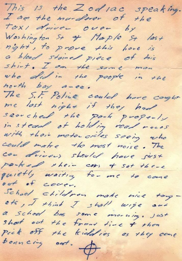
Here’s is an image of the "Stine" letter.
If you look at it the right way up, the "d’s" look funny.
They’ve been described as oddly "cursive" in the past – as a characteristic handwriting trait, one that sets him apart, etc. etc.
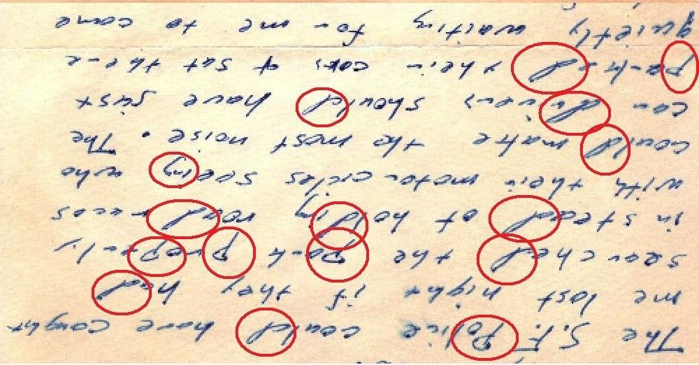
Turn it upside-down and have a look. Here:
Aren’t they odd. Don’t they look just like letter "p’s" drawn in with the paper upside-down?
Would it explain the strange spacing in some words (such as the ones Morf and I like so much, the "ght" endings) if the writer was rotating the paper, to disguise certain characters? I think perhaps it would. Sometimes the writer seems to leave too much space for his upside-down characters – sometimes (such as in the Stine letter "dd’s" )- it throws the character baseline’s off.
I’ve circled the "p’s" too, They also look a little strange. The "rest" marks where the pen’s stayed on the paper longer are interesting.
Since he obviously disguised his handwriting in the Riverside letters (if not so well on the envelopes), then……
I stole Mike’s idea to test someones handwriting by telling them to write some phrases with "d’s" in them. They also sweetened the pot by giving me an unprompted "p." I then asked for a cursive "p", which confirmed my idea.
In my sample, the "d"s were distinctive in formation from the "p"s and did not match when flipped. So are Zodiac’s. If you allege that his "d"s are upside down "p"s, then logically the counter should be true. That’s why I asked for the cursive "p". Mine did not match the construction of zodiac’s alleged "p" disguised as upside down "d"….sure that only proves that my friend is not the Zodiac, but it aligned with my presumption that Zodiac’s "d"s are not constructed the same way as a cursive "p" would.
Certainly his "d"s are very distinctive, but his "p"s seem natural to me and not reversed so I don’t conclude that the counter is true.
I think what you are looking at are not upside down letter, but unique letters to Zodiac. He simply has writing, which many of us feel we could recognize if we saw it someplace else, it’s very distinctive. I think Z tried to hide his writing to some extent, but going as far as to slant the paper as he wrote, or write fast & sloppy. As far as the letter design, and formation goes, I think that’s all his natural writing.
One of the best samples to use are his ‘little list’ letter. That is a very long letter, and would be hard for him to consistently fake all the way thru. I always refer to that letter when checking against other Suspect’s writing. Also, the car door at Berryessa, although not a lot to work with, I think that’s his real, unedited,undisguised writing, as he simply would likely be nervous and looking to get out fast and therefore, would not have alot of time to disguise it. Another good sample is the ‘Badlands’ mailing. He didn’t sign it as zodiac, and would have no way to know it would ever be linked to him, so likely, it’s his true writing, undisguised
There is more than one way to lose your life to a killer
http://www.zodiackillersite.com/
http://zodiackillersite.blogspot.com/
https://twitter.com/Morf13ZKS
Well, it certainly displeases me that the "d’s" in the Badlands (Citizen) and Little List letters don’t look like the ones in the earliest 3, or in the Stine letter I’ve used to illustrate that "upside-down" allegation. Hmmmm.
Not odd then, that?
And if the Badlands letter is Zodiac-undisguised, (which it certainly is – and my favorite letter) – ain’t it interesting that there’s no spelling errors in it? That’s revealing too, isn’t it?
I see what you are saying Smithy, and I actually think that idea has a lot of merit. The P’s look odd to me as well.
Take a look at the "b"s. They look like the letter q.
What information does the dot of ink, indicative of having rested at that point at either the beginning or end of a pen stroke, offer?
As for those little blobs of ink at the beginning or end of a stroke, I kind of see that. Does it prove those letters were written "upside down?" Who knows? Michael Wakshull has not answered answered "Professor" Horan’s question about that on his Amazon page. But this is what I think is weird: what about the blobs of ink at the top of so many e’s? Wouldn’t that be in the middle of the stroke? They are also very visible in the o’s, but that makes sense. Most people probably write their os that way. But the e’s???
PS Maybe Mr Wakshull answered Horan in a private email, but why not answer him publicly?
I apsolutely agree with you that the p’s and d’s (and b’s?) are written udsipepown. You are peap right apout that. Goop jop. Very opservant!
Ya think? I’m not sure….
I apsolutely agree with you that the p’s and d’s (and b’s?) are written udsipepown. You are peap right apout that. Goop jop. Very opservant!
What about the Belli letter? Do you think it looks like the other letters? "Upside down" or not?
The handwriting on the July 31st Chronicle envelope is similar to the Belli letter:
http://zodiackiller.com/ChronicleEnvelope.html
It is.
The "formal" styl, some call it, don’t they?
He put some extra effort into writing the name of the Chronicle on envelopes, didn’t he? A pity we don’t have the envelopes from the first letters…
The handwriting on the July 31st Chronicle envelope is similar to the Belli letter:
That’s not much a sample, though.


