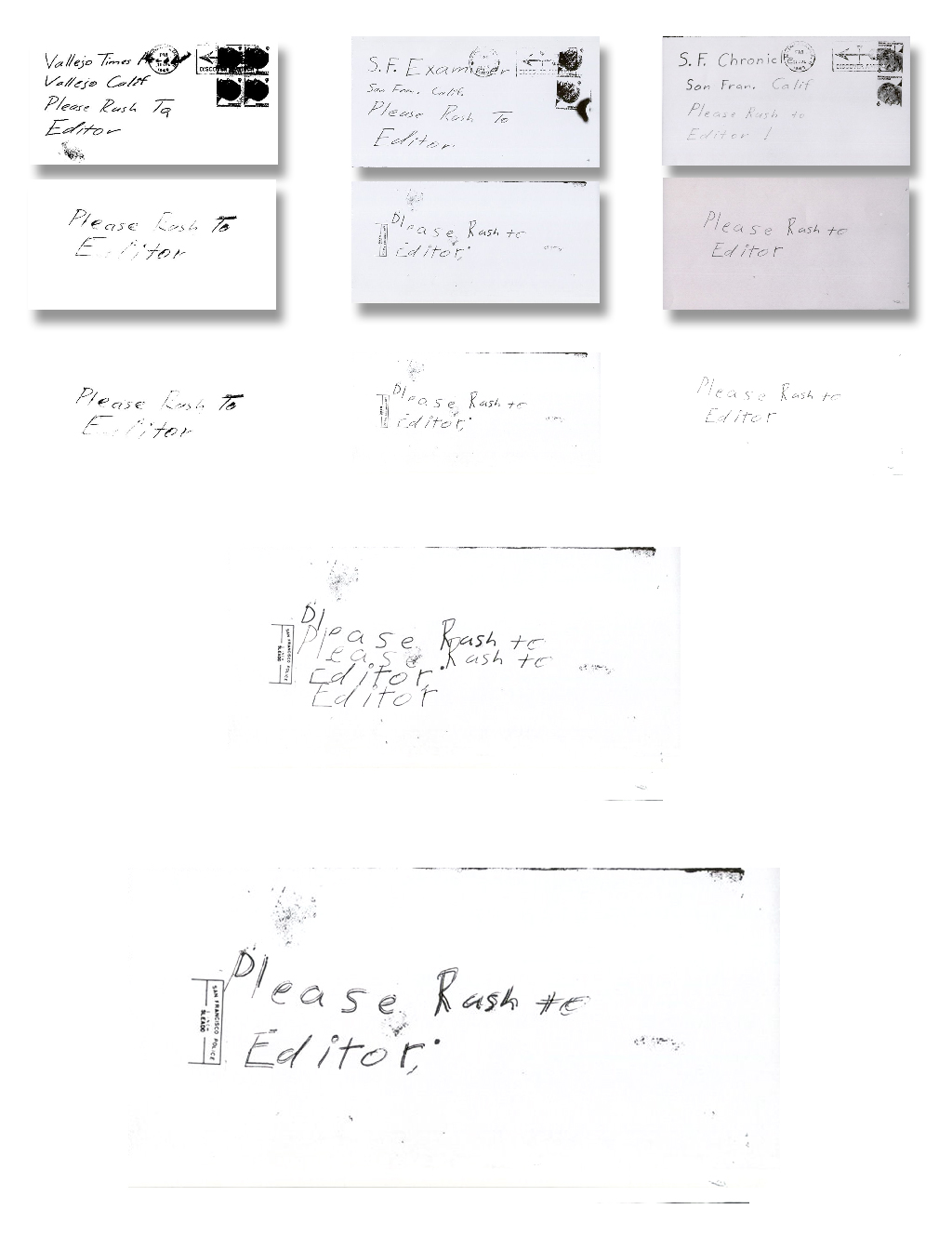
There’s alot of good analysis here with regard to handwriting comparisons…..an observation made several years ago with regard to the backs of the Chronicle and Examiner envelopes, re the printing of "Please rush to editor"…While one is not a carbon copy of the other, they are identical. The best explanation I’ve seen to explain this, is the possible use of a Polygraph (duplicating device). I wonder if anyone agrees or has an alternative explanation.
If the suggestion is the most logical, what do you think it means (if anything) with regard to the overall analysis of Z’s handwriting?
I’m not so sure on the use of a duplicating device but there certainly seems to be duplicating or at least re-producing even if it is done by hand. I assume this is what you are referring to.
I have to say that after overlaying them on the bottom image, they are identical, an actual ‘carbon copy’. There is some variation on scale and some minor distortion in regards this but these are the same. There are a few more marks on one than the other and a period and comma but the actual letterforms are identical.
That is rather curious and thanks for bringing it up.
Slightly perplexing in that my only logical thought on it is that we are looking at two different re-productions of the same envelope back. Maybe I’ve got 2 versions of the same thing and I’m comparing one with the other by mistake? If these are the correct images and purportedly from 2 different envelopes that’s very odd.
I’ve included the times envelope as well because, despite not being the same letterforms the overall shape used is the same. We see this non-identical copying in the Bates letters as well.
Thanks for the input Trav. I’m still not 100% sure, however, in concentrating on the differences…variation in scale, the distortion and the extra marks on one, they do appear to be (as labelled) different envelopes. I also note the "missing" piece of the P (in PLEASE) on one. I still favour the polygraph overall
as it’s "one" answer that may account for all differences, including pressure. That said, I’m not married to it and am willing to be persuaded otherwise.
Of course the big question is, Why he did it…if genuine.
The polygraph idea is interesting. Certainly seems more sophisticated than one might fits think.
http://en.wikipedia.org/wiki/Polygraph_ … ing_device)
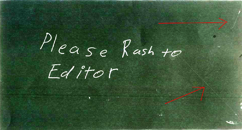
To be honest though I think this is crossed wires. I would need to find more solid confirmation of the authenticity on these envelope backs. I unfortunately don’t know off the top of my head where I came by the images I’ve used here. In my envelope presentation I have them paired up as they appear here so I can only speculate that I got that information from somewhere to do that. My feeling on it is I’ve just grabbed it from somewhere where it was paired up with and presented as the backs to those envelopes.
One is clearly a copy with the label on it and bits missing. If you look at the area with the parts missing it looks like the label was printed on a piece or paper and then cut out and laid over the envelope (not very carefully) and then copied. The edge outlined by the missing parts seems too clean to be copier degradation.
The other appears to be a direct scan or a scan from a photograph and possibly odd for being the back of an envelope there appears to be a distinct lack of seams, joins, or flaps. My gut tells me that these are two versions of the same thing but I have no idea where the ‘photographed’ one surfaced from and I don’t have much faith in it’s provenance until I know better.
I couldn’t argue with that, we would need to be sure that there wasn’t some error/mix up when these were published. That said, I did mention this to a case detective sometime back and his reply was " they would be aware of that". Still not sure what that amounts to to be honest, he didn’t elaborate. In the context of the conversation it meant one of two things…there was some form of copying at play that he was already aware of it or he was assuming if there was ,"they" would be aware of it!
This is a really interesting and new find. I am interested to see what comes of this. Some have spoken of using a light table re: the ciphers and the idea
of Z using a ‘polygraph’ drawing machine with the letters, etc. fits with that idea.
-glurk
——————————–
I don’t believe in monsters.
Tom posted high-res copies at zk.com: http://zodiackiller.com/letters_index.html
This one shows a postmark goof at the bottom right: http://zodiackiller.com/SFCEBHR.html
An observation that may help us decipher what’s going on here…….Look and compare both the Chronicle and Examiner letters. Clearly the Chronicle letter appears to be written either with a thicker nibbed pen or extra pressure, the writing is much thicker in the Chronicle than the Examiner.
However, when we compare the backs of those same envelopes (as labelled) and the "Please Rush to Editor" print, the situation appears to be reversed.
It’s almost as if the Chronicle labelled back belongs to the Examiner and vice versa.
The heavier print (examiner labelled) is also the one with the extra marks (dot and comma after "editor) that does not show up on the other. However just to preplex us more, the heavier print is also the one with missing letter sections such as the P. (more on that later)
However, regardless of those observations we are still left with two different writing thicknesses. Now place one over the other and align the P In "Please".
You will notice that while appearing identical the whole thing does not line up. When we move along putting each letter over it’s corresponding partner, they appear identical and for all intents and purposes are, with the exception of thickness.
Experiment and change Chronicle on top of Examiner and vice versa. From what I can see, they are actually two different letters/sets of printing and not some error by way of mix up. I still believe all is best explained by the use of a polygraph…two different pens and or two different pressures.
Thoughts?
For sure two different pens. The ink ran out of his felt-tip so he switched it up.
Very nice thinking to check against the contents W, i.e the letters.
I have more I can look at regarding these and will but just a word of caution first.
When it comes to things like pressure or pen weight or type of pen etc you can’t make that comparison accurately. Now I’m not talking about looking at something on screen vs having the thing in your hand, we are all subject to that constraint unless someone here owns an original Zodiac letter. I’m talking about what we do have to work with, but more importantly the technical provenance of these items.
In this instance we have a little assistance in that there are 3 sources – The SF Chronicle, The Vallejo Times-Herald and The SF Examiner. The assistance is that two of these, or at least part of two of these (letters) are of sufficient quality to suggest that, in the commission of these 3 letters and their envelopes, at least two different pens were possibly used. I would even go as far as to change the possibly to probably and even throw in a devil-may-care, in all likelihood.
Why so cautious?
Well quite simply it’s experience. I’ve copied more things in more different ways and combinations of those ways in 20+ years as a designer than I care to remember. I’ve seen how and in what specific ways the quality of certain mechanisms vary in the same time period and over time, even short periods of time like a week or even a day. How the quality of the material onto which you are copying onto and from can affect distortions you wouldn’t expect. From photographs to PMT’s (photo mechanical transfers, re-pro camera) to faxes to copiers to scanners. The degrees of variation within these methods alone are many nevermind when you start combining them and I have.
This is what I mean when I say ‘technical provenance’. Even in this wonderful digital age there are and have been changes affected to what we have ultimately ended up with in front of us on our screens.
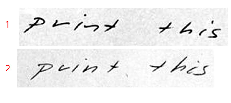
Here’s a little example.
Which one is the heavier pen?
I’ve noticed something else that might be slightly awry.
If anyone cares to take time, and I think this is where we should start with this, can you, from the sources we have, match the envelopes to the letters visually?
Even just have a look and tell me what issues you start to notice. I may have spotted something but I need to check and don’t have the time right now.
I agree about being cautious about copies….that’s why those high-res photos are so important, imo.
I’ve noticed something else that might be slightly awry.
If anyone cares to take time, and I think this is where we should start with this, can you, from the sources we have, match the envelopes to the letters visually?
Even just have a look and tell me what issues you start to notice. I may have spotted something but I need to check and don’t have the time right now.
Well just visually, it looks like the Times Hearld ( even though not part of the comparisons) stands alone. The ink is running, it’s smudged as is part of the envelope. Letter and envelope fit together. The paper also looks inferior on this one.
To be honest, I wouldn’t change the others either, save for my earlier comment i.e it "looks like" the back of the Chronicle envelope is closer visually to the Examiner letter. That said,it also appears (chronicle letter) that the pen is on the way out, the writing gets weaker the further he goes. This matches the front of the Chronicle envelope. ( same pen on the way out).However,I wouldn’t be at all surprised if the back was written with a different pen. The printing is consistent throughout with no sign of "fade"
I actually have good Hi resolution "copies" of both Chronicle and Examiner letters. Short of something I really do not understand I can see no way these two letters were written with the same pen. After re-examining I couldn’t even account for it as pessure related…it just looks like two different pens!
I’ve noticed something else that might be slightly awry.
If anyone cares to take time, and I think this is where we should start with this, can you, from the sources we have, match the envelopes to the letters visually?
Even just have a look and tell me what issues you start to notice. I may have spotted something but I need to check and don’t have the time right now.
Well just visually, it looks like the Times Hearld ( even though not part of the comparisons) stands alone. The ink is running, it’s smudged as is part of the envelope. Letter and envelope fit together. The paper also looks inferior on this one.
To be honest, I wouldn’t change the others either, save for my earlier comment i.e it "looks like" the back of the Chronicle envelope is closer visually to the Examiner letter. That said,it also appears (chronicle letter) that the pen is on the way out, the writing gets weaker the further he goes. This matches the front of the Chronicle envelope. ( same pen on the way out).However,I wouldn’t be at all surprised if the back was written with a different pen. The printing is consistent throughout with no sign of "fade"I actually have good Hi resolution "copies" of both Chronicle and Examiner letters. Short of something I really do not understand I can see no way these two letters were written with the same pen. After re-examining I couldn’t even account for it as pessure related…it just looks like two different pens!
I was thinking maybe it was running low on ink
There is more than one way to lose your life to a killer
http://www.zodiackillersite.com/
http://zodiackillersite.blogspot.com/
https://twitter.com/Morf13ZKS


