
This is another consideration I had already thought about, perhaps more speculative, but still quite intriguing. It concerns the first four letters “IUBL,” on which I have an additional reflection, beyond what I already mentioned regarding the ZIP code 50100 and the final “E.”
It is also interesting to look at where these letters come from:
I from “UCCIDE” (kills)
U from “ULTIME” (last / final)
B from “BHOPAL”
L from “ALTO” (high / higher)
Beyond the more technical and cryptographic aspects, which remain the more solid part, this also opens the door to a more intuitive reading. If you look at the source words, they almost seem to suggest an implicit message, something along the lines of:
“I kill for the last time. But the number of victims is actually higher.”
The reference to Bhopal, which evokes an event with a very high number of victims, seems to point in that direction: the idea that the real number is greater than what appears.
This is not something I can prove rigorously, but in my view it fits reasonably well with the broader picture, especially with the theme of victim counting in a cryptographic sense.

Nicely presented!
Do you think that he would already have wanted to add ‘FIRENZE’ if, having written only up to ‘REP.’ he was intending to hand deliver the envelope?
“This isn’t right! It’s not even wrong!”—Wolfgang Pauli (1900–1958)
I should verify this more carefully, but this is an interesting example:
https://www.mostrodifirenze.com/1985/10/01/1-ottobre-1985-recapitate-due-lettere-anonime-per-paolo-canessa-e-francesco-fleury/
These are two envelopes sent to two prosecutors, without stamps and delivered directly to the prosecutor’s office.
Officially, they are not attributed to the Monster, although I personally believe they are (I have also identified what I think could be a coded message in them).
What is interesting is that, in these envelopes, the first name appears before the surname of the prosecutor.
I am thinking out loud here, about some of the potential consequences that we may have to accept in your theory following from the idea that he may have initially intended only to hand deliver the envelope.
Firstly, had this been his initial plan, which he changed later, I do not see any reason why he would not have proceeded with the next step which was to glue the letters so far onto the envelope. This would then have meant that the first ‘I’ in ‘SILVIA’ would have already been fixed as having come from ‘UCCIDE’ on a page of its own, even before the author had considered adding ‘IUBLIAE’ in just this very manner.
It’s actually hard to think over all the possibilities as to what Il Mostro may have been planning at the outset, assuming it to have been different from what you propose he did ultimately.
“This isn’t right! It’s not even wrong!”—Wolfgang Pauli (1900–1958)
It is possible that he initially selected and arranged the letters on the envelope without necessarily gluing them immediately, using them as a kind of draft or provisional configuration.
At that stage, he may have realised that the result was not yet satisfactory or that something was missing, which could have led him to look for a more complex or meaningful solution. This might have included, for example, the later addition of further elements or the reorganisation of some of the letters before reaching the final version.
I admit it is difficult to make solid hypotheses, but this reconstruction could open up an additional possible interpretation of “IUBILAE” as well.
In any case, I think I will complete the report next week on the issue of randomness in the correspondence between Latin words and English words. Codex is a very useful tool, but it is better to independently repeat and verify the results.
Now I’m going to sleep. Good night!
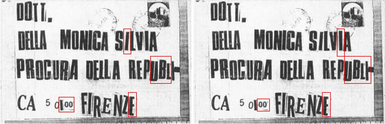
Sorry to divert from the main point of discussion here, but I wanted to check out what specifically you were using as a source for the identification of where each letter on the envelope came from, as you detailed in an early post using the following figure:
I remember specifically a post (here) in which you corrected yourself and noted that the ‘O’ in ‘PROCURA’ comes from ‘SALERNO‘ (p. 34) and not from ‘QUANDO‘ (same page). However, having done a little experimenting today I seem to have found this ‘O’ as having indeed come from ‘QUANDO’, whilst it is the ‘O’ in ‘DOTT.’ that comes from ‘SALERNO’.
All this depends, of course, on the validity of the image I posted earlier showing the reverse sides of each letter, as having the order correct when this was laid out.
“This isn’t right! It’s not even wrong!”—Wolfgang Pauli (1900–1958)
@shaqmeister Good point for asking. I’ll recheck everything tomorrow evening and clean it up!
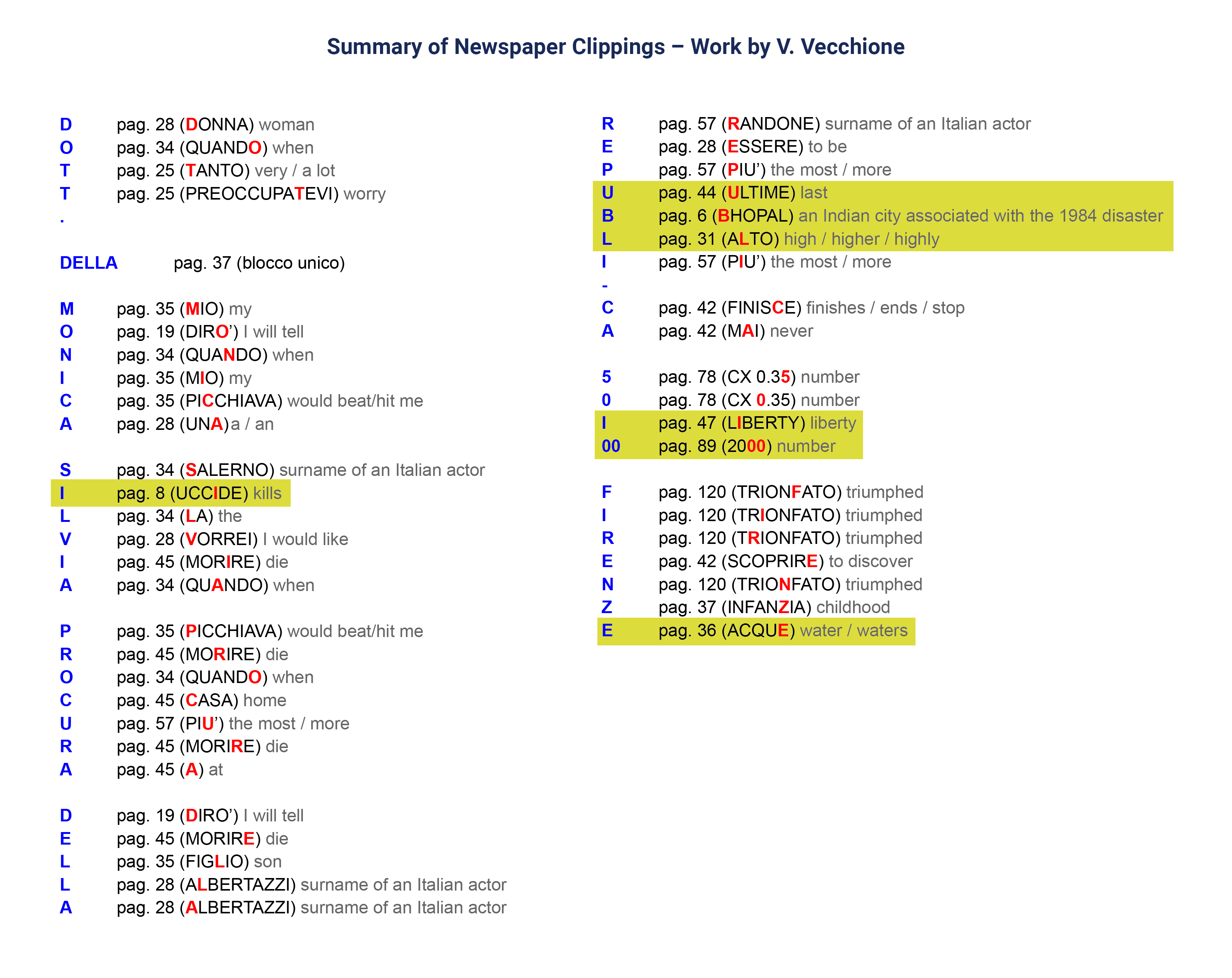
On the letters cut from p. 34 of the edition of Gente, the following shows an attempt to trace them back to the pages identified by V. Vecchione using an image of the reverse of each letter posted previously. In this image, the middle band shows the equivalent strip of p. 33, allowing comparison of the reverses in the third row as to where they were cut from. Note, it is assumed that the sourced image shows the letters in reverse laid out precisely as they were removed from the letter and not inadvertently mixed up.
“This isn’t right! It’s not even wrong!”—Wolfgang Pauli (1900–1958)
A few points are notable here, if we can trust the reversed image.
Firstly, it appears clear that, in several obvious instances, Il Mostro cut letters slightly wider than he needed. This is evident in the case of the ‘O’ used in ‘DOTT’ (2.) and the one used in ‘PROCURA’ (20.) as well, also, with the ‘N’ in ‘MONICA’. Indeed, as the reverses shown are those of the letters actually pasted, we have to understand that at the final composition stage the author was forced to use overlaps to hide stray edges of unwanted letters. (Either that, or the image at bottom, taken from one of Vecchione’s videos, is a loose reconstruction only and not the backs of the actual letters.)
A further point of note is the fact that, for a couple of vertically symmetrical letters, these appear to have been pasted inverted; as, for example, the ‘O’ (2.) and the ‘N’ (8.)
“This isn’t right! It’s not even wrong!”—Wolfgang Pauli (1900–1958)
(Either that, or the image at bottom, taken from one of Vecchione’s videos, is a loose reconstruction only and not the backs of the actual letters.)
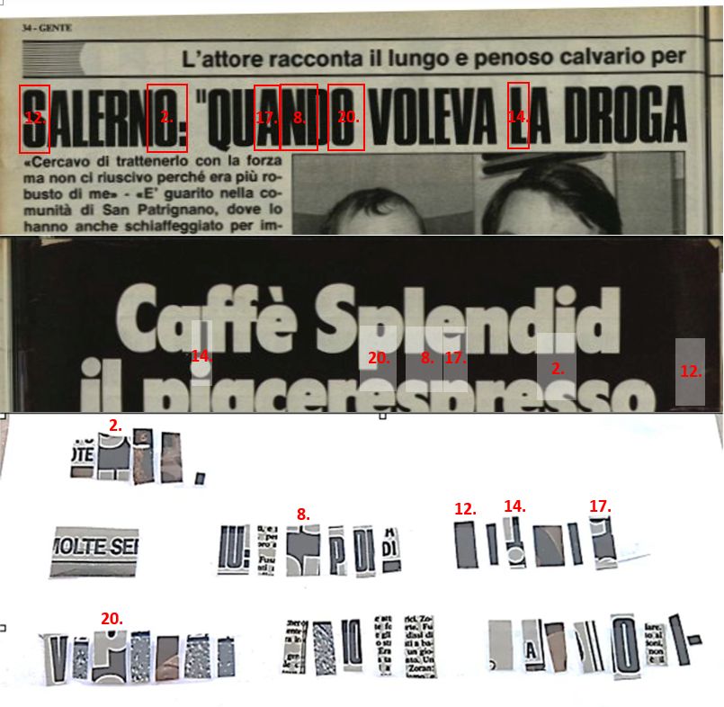
And, in fact, closer inspection confirms that the previous image showing the reverses of the letters as cut from the magazine is merely a reconstruction, and hence nothing too specific may be drawn from it.
We can see this clearly if we compare the reverses here with the traces as left on the actual envelope following removal (see Figure 2 here, at mostrodifirenze.com). There are certainly no obvious overlaps apparent on the actual envelope, whilst there are clear differences in the sizes and precise shapes of the cut-outs between the two images.
This is evident also when we consider individual letters. For instance, on the actual envelope, the reverse of the ‘M’ of ‘MONICA’ sees the letters ‘IU:’ extending to the very bottom of the clipping, whereas on the now-assumed reconstruction, the cut is lower and includes part of the line below.
“This isn’t right! It’s not even wrong!”—Wolfgang Pauli (1900–1958)
Ciao! I’m sharing this summary with you; as you can see, it’s not that different from yours. However, I tried to approach it from a slightly different starting point, namely that the author may have initially used the letters primarily to construct “DOTT. DELLA MONICA SILVIA PROCURA DELLA REP.”
Yes, I can follow your reasoning here. In particular, your proposed selection up to this point does not include any instances of any letter having been taken from any page on its own (even though the first ‘I’ in ‘SILVIA’ will ultimately become just such a letter).
This, then, adds weight to the argument that this subsequent idea was possibly added intentionally, once he had decided to continue beyond the original ‘REP.’, with one of the lone ‘I’s then getting swapped into ‘SILVIA’.
“This isn’t right! It’s not even wrong!”—Wolfgang Pauli (1900–1958)
Then, to follow this idea through, I find myself having to ask whether the ultimate choice for positioning the single-page letters might have been better achieved through the arrangement on the right-hand side, below. In all aspects, this achieves what the actual arrangement would appear to suggest, whilst also maximising use of the ‘appearance’ of ‘IAUBLIE’ formed from the ends of the last three lines.
The fact that the ‘A’ here is not included in this pattern, but the ’00’ is, would then be immediately suggestive of your proposal that the ’00’ is to replace the ‘A’ but then to be handled differently on applying the letter shifts.
“This isn’t right! It’s not even wrong!”—Wolfgang Pauli (1900–1958)
Ciao! I confirm what you wrote: the image showing the back of all the newspaper clippings is a reconstruction made by V. Vecchione, who tried to reassemble the envelope in order to evaluate the difficulty and the time required to create it.
As for the “00”, he chose this solution (as I mentioned at the beginning) probably to provide a valid interpretative key for anyone trying to decipher the possible encrypted message: keeping the A fixed and applying shifts to the remaining letters.
I also asked myself about the “I”, and this is the explanation I came up with. He really liked the “I” from LIBERTY and wanted it to appear in IUBILAE because of its meaning. However, the font was too different from the others, and it could only fit in the last line, where the typography seems more flexible. He therefore had the “I” from FIRENZE available, but perhaps because of its size he placed it next to the numbers, making it look like a “1”.
He also needed to reach 10 letters in the last line (see the e-mail), which is why it was inserted into the postal code. Perhaps the fact that there are exactly 10 letters in the last line was itself intended as a clue suggesting the shift, but of course that is impossible to know for certain.
At that point there was only one remaining “I” to place, and the only available ones were those from SILVIA. I cannot really say, however, why he preferred one over the other.
Ciao! I’m sharing this summary with you; as you can see, it’s not that different from yours. However, I tried to approach it from a slightly different starting point, namely that the author may have initially used the letters primarily to construct “DOTT. DELLA MONICA SILVIA PROCURA DELLA REP.”
Yes, I can follow your reasoning here. In particular, your proposed selection up to this point does not include any instances of any letter having been taken from any page on its own (even though the first ‘I’ in ‘SILVIA’ will ultimately become just such a letter).
This, then, adds weight to the argument that this subsequent idea was possibly added intentionally, once he had decided to continue beyond the original ‘REP.’, with one of the lone ‘I’s then getting swapped into ‘SILVIA’.
As you can see, all the letters match and only characters from the same font are used. The only thing I do not particularly like about this reconstruction of mine is that, while for “DOTT”, “DELLA MONICA” and “PROCURA DELLA REP” the letters are relatively concentrated, to write “SILVIA” he seems to have used many more pages just to obtain a few letters.
Another aspect, although probably a marginal one, is that words such as “DROGA” and “SANGUE” do not seem especially consistent with his usual themes or imagery, whereas terms like “UCCIDERE” and “MORIRE” appear much more in line with them.
Ciao, @lendor-77. Yes, on having followed through your initial idea this far, the suggestions that you make in your previous post certainly do seem reasonable ones at this point. 👍
“This isn’t right! It’s not even wrong!”—Wolfgang Pauli (1900–1958)